Understanding RGB and CMYK: Why Colours Look Different in Print
In this article, we’ll explore the limitations of matching RGB colours to CMYK, helping you understand the challenges involved in colour conversion. Our goal at UK Printing Company is to provide clear, practical information so you can set realistic expectations for your printed products.
As our lives become increasingly digital, more artwork is being created and supplied in RGB format. While this allows for a stunning range of vivid, luminous colours on-screen, it also introduces challenges — many of these shades cannot be reproduced exactly using the traditional CMYK four-colour printing process.
When working with a design agency or graphic designer, it’s essential to select brand colours that perform well both digitally and in print. Most major brands choose colours that remain consistent across all types of media.
As a leading UK-based large-format printing company, we aim to help our customers understand how these colour differences affect their printed materials — and how to achieve the best possible results.
What Are RGB and CMYK Colours?
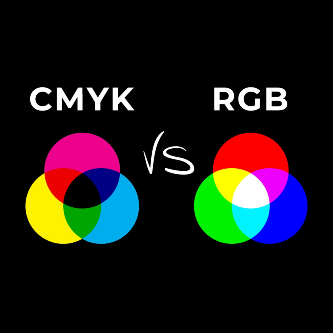
When designing graphics on a screen, colours are displayed using the RGB colour spectrum, which is based on light. RGB stands for Red, Green, and Blue, and by combining these three light sources, screens can produce bright and vibrant hues.
However, large-format printers work differently. They use CMYK inks — Cyan, Magenta, Yellow, and Black (K) — to reproduce colours with pigment, not light. As a result, the printed colour range (or colour gamut) is smaller than what’s visible on a backlit screen.
Colour Gamut and Output
RGB has a wider colour gamut than CMYK. This means RGB can display more vivid and saturated tones — including some that CMYK inks simply cannot reproduce.
When an image designed in RGB is converted to CMYK for printing, certain bright colours (like neon greens or deep blues) can appear less intense or slightly duller. This is a natural and unavoidable part of the printing process, not an error.
Common Colours Affected by Gamut Limitations:
-
Bright greens
-
Bright cyan blues
-
Oranges
-
Deep blues
-
Intense reds
While colour management tools can help minimise these differences, they can’t completely eliminate them. Understanding these limits helps ensure your printed materials meet realistic expectations.
The Differences Between RGB and CMYK in Large Format Printing
RGB and CMYK use completely different methods to produce colour, which is why printed items may not perfectly match what you see on-screen.
-
RGB (Additive Colour Space):
Colours are created by combining red, green, and blue light. Mixing all three at full intensity produces white. This method is used for digital displays like monitors and smartphones. -
CMYK (Subtractive Colour Space):
Colours are created by applying cyan, magenta, yellow, and black inks to a surface. The inks absorb (subtract) light, and when combined, create darker colours — eventually black. Because this process uses pigment instead of light, colours appear differently than on digital screens.
Colour Consistency Across Materials and Devices
Another factor that influences colour output is the printing substrate (the material being printed on).
Different materials absorb and reflect inks in unique ways:
-
Coated materials (like PVC banner media) produce sharper, more vibrant colours.
-
Uncoated materials (like polyester fabrics) deliver softer, less saturated results.
Even when using the same CMYK file, colours can vary across substrates due to differences in ink absorption and light reflection.
Conclusion
While RGB offers a wider and more vibrant colour range, not all those shades can be reproduced exactly using CMYK inks. Some colours — especially bright blues, greens, and oranges — may appear less vivid in print.
At UK Printing Company, we believe that understanding these technical differences helps our customers make informed design decisions and achieve the best possible print results. By being aware of the natural limitations between screen and print, you can plan ahead, avoid surprises, and ensure your finished products look professional, consistent, and true to your brand.